Movie Poster Analysis
Here are some horror movie posters that we like the idea of, weither it be through its picture, font styles or the colours used.
|
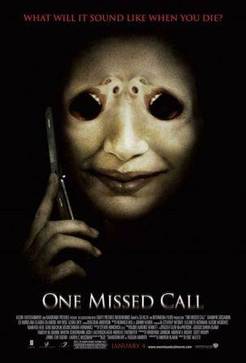
One Missed Call (2008)This movie poster is very effective with just the one clear image. The black and white theme of the poster is simple however creates an eary atmosphere. The colour red, often related to the horror genre, is introduced in the date of its release and in the slogan. The simple font style used is clear and easy to read, however the blurred affect added to the bottom half of the title makes it more mysterious and horror like. The editing on the face is very clever as they have made the eyes out of people’s mouth and nose. This detail adds more depth to the poster and also becomes more intriguing to the audience.
|
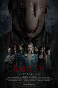
Smiley (2012)This poster is a completely different style compared to “One Missed Call” and contains a lot more detail. This poster has a couple of layers to it. With the Smiley character in the background and is on a large scale it gives the effect that it has more power of the people in the foreground who are a lot smaller. By having a girl in the centre of the other people it shows her importance in the film, also by her having blonde hair it suggests she will be the “Classic” victim. The colour red also appears in this poster relating back to horror. The font of the main title is easy to read, however they have added an effect making the writting look rough and old.
|
|
|
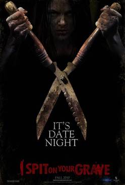
I Spit On Your Grave (2010)The image in this poster is very intriguing as at first you straight away see the garden cutters but then you notice the girl in the background. By having the image of the girl unclear and much darker it makes her look more mysterious and haunting. The colour black is very popular in horror posters which relates to a "classic horror" where bad events happen at night. The font used is slightly confusing and misleading as "It's date night" looks as if it's the name of the film, however it's just the slogan. To stop confusion the size of the slogan could be edited smaller so the audiences attention goes straight to "I spit on your grave" instead. Unlike the other horror posters on this page, this one has no titles at the bottom of who was involved in the creation of the film.
|
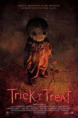
Trick 'r Treat (2007)This poster is different from the others due to its use of colours. The orange tones relate to the films theme of Halloween. The image of the doll/child becomes more intriguing with the dim light as it encourages the audience to look closer. The title font is completely different from the others as it is very thin and looks as if it has been hand written. With its yellow/orange glow effect it relates back to Halloween again and also candle light. The candle light can be linked in with the pumpkin the doll/child is holding.
(Abbey Mustoe) |
|
