Title Analysis
Our trailer will include titles that will help summarise our storyline. While doing our titles we needed to do some research into existing titles. We will be looking at the font style, its size, its colour, its background, and how it comes on and off screen. Here are a few screenshots of titles we like:
Sinister (2013) |
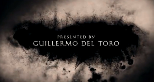
Mama (2013)The use of black makes the titles look dark and dingy and makes the white text stand out. The choice of font adds a classical feel to the shot as its plain and easy to read as it has no effects added to it. By using a blurred effect on the edges of the frame it creates an eerie atmosphere and becomes mysterious. The dark patch behind the text gradually grows which is effective as it adds movement to the frame without taking the viewers attention away from the writing.
|
|
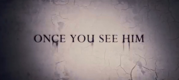
The use of grey in the background makes the black writing standout, and with the edges of the frame being darker and the centre brighter, it draws the viewers eyes more to the text. The smudged effect on the text adds depth and mystery to the trailer, along with the cracks in the background, which gradually grow.
|
|
|
The conjuring (2013)The black used for the background with the smoke/crack effect is dark and gloomy which is great for the horror genre. The white writing with no effect is great as it stand out and is clear to read. The use of different sized words help make the film titles stand out which works well as the most important information is made clear.
|
Insidious 2 (2013)We also see a dark background in these titles, however these have a rough look to it and the bottom of the background is a lot darker than the top, giving a worn away look. Once again the title in white stands out from the background and is in a simple font which is easy to read.
|
|
After looking through many designs of titles from lots of different trailers we have learnt that the font has to be simple with no fancy effects. This is because the titles only appear in the trailer for a few seconds so the viewer must be able to read then quickly and easily. We have also noticed that the colour of the titles is usually an opposite colour to the background so they stand out. Dull and gloomy colours are popular for the backgrounds and usually have movement, however this is only a small amount so
the viewers focus isn't taken away from the text. While creating our titles we will remind ourselves of these designs and what works well.
(Abbey Mustoe)
the viewers focus isn't taken away from the text. While creating our titles we will remind ourselves of these designs and what works well.
(Abbey Mustoe)
